This tutorial introduces you to the ASP.NET Server Controls. In particular, it covers the basic Asp.Net controls that are frequently used in web forms: TextBox, Label, Button, CheckBox, and RadioButton. We will also develop a simple text editor application by using the controls introduced in this tutorial.
Introduction to ASP.NET Server Controls
Asp.Net web controls are defined by a special tag which always starts with “<asp:” prefix, followed by the corresponding control class name. For example, the tag will be <asp:Label for Label controls, <asp:TextBox for TextBox controls, and so forth. Within ASP.NET tags comes the attributes which are actually the properties of the selected control (e.g., ID, Text, etc.), and also listed in the Properties window. There are two mandatory attributes for every ASP.NET control: ID (which has to be unique per page) and runat=”server” which indicates that the control will be processed by the ASP.NET Web Server (i.e., IIS). The following image summarizes the sections of ASP.NET tags:

ASP.NET controls share many base properties, such as ID, AccessKey, BackColor, ForeColor, BorderWidth, Enabled, Font, Height and Width, Tooltip, Visible, and so on. However, there are also many distinct properties of each control.
TextBox Control
Whenever you need some input text from the user, TextBox is the control that you need in your web form. Basically, TextBox allows users to enter some text. ASP.NET TextBox control comes with many properties for customization. By default, TextBox control is a single-line-textbox once placed on the form. You can convert it into a multi-line textbox via its TextMode property (i.e., TextMode=”MultiLine“) or if you have a textbox to which user will enter some sensitive information such as password you can set TextMode=”Password“.
You can also customize the appearance of the TextBox control. You can change the characteristics of its border (BorderColor, BorderWidth, and BorderStyle properties), text-color (ForeColor property), the background-color (BackgroundColor property), and font (Font property). These are actually base properties shared with many other controls. Also, you can use Columns property to adjust the width of the textbox in terms of the number of characters, and use Rows property to adjust its height in terms of the number of lines within the textbox.
You can also control how data is entered into the textbox. For example, you set the ReadOnly property to False to prevent user input, or you can set a limit on the number of characters that user can enter by using MaxLenght property.
With the following visual I tried to categorize the properties of textbox based on frequency that you are likely to use them: the darker the yellow, the more frequently the control property is needed. All possible values (or types) per each property is also displayed.

(The declarative syntax is retrieved from MSDN)
Label Control
Label control is used to display a textual information at a specific location in your page. For example, if the form submission fails or succeeds you may want to inform the user by displaying a message with a Label control. Label control is a very basic control and most of the time you will use its Text property to print some messages on the label. The following image shows all properties of Label controls and color-categorizes them based on how often you would need them:

(The declarative syntax is retrieved from MSDN)
Button Control
Button control, when clicked, submits the page back to the server for performing some certain functionality. When a button is clicked the page will be posted back to the server and Page_Load event will be executed before the Control events (such as Button_Click where you want to execute a set of code to perform some functionality) are executed. Please refer to the ViewState and PostBack tutorial if you want to learn more about PostBack event.
Button controls can also raise some client events before submitting the page to the server. That is, Button controls can raise events both at the client-side also at the server-side. The server-side events need to be executed by the server and they are defined in the CodeBehind file (please see the image below).

You may want to raise some client events as well. For example, you may need to perform some validation (is the email address entered valid, or if the password-length is within the character limit) and cancel the form submission if validation fails. OnClientClick property is used to raise client-side script. Please add OnClientClick=”return confirm(‘Sure to delete?’)” attribute to a button control and try it it. This will run a JavaScript code that brings a confirmation dialog. If you click Cancel the page will not be posted back to the server, otherwise it will create postback event. Please see the following image.

Below is all the attributes of the button control:

(The declarative syntax is retrieved from MSDN)
CheckBox Control
CheckBox control is also used for user input that is Boolean type, True (if CheckBox is marked) or False (if CheckBox is unmarked). For example. CheckBox is commonly used to help users indicate if they agree terms and conditions or not. Checked property is used to read whether CheckBox is marked or not marked. You can also (un)mark a checkbox programmatically by setting Checked property to True/False.
When AutoPostBack property is set to True, the CheckBox behaves like a button: when the check state of a CheckBox is changed, the page will be submitted to the server for processing. You will need to double click on the checkbox to automatically create the OnCheckedChanged event handler in the codebehind file. This event handler will be executed on the server if the post back event occurred because of the checkbox.
RadioButton Control
RadioButtons are arranged in groups to allow users to choose only one item among a set of predefined list. If RadioButtons share the same GroupName property, they will be logically-grouped. I recommend using RadioButtonList control, which is more advantageous and handy in many aspects.
Simple Text-Editor Application
By using the web controls covered in this tutorial, let’s design a simple text editor. Our application will look like this when completed:

Let’s first design the interface. In our interface, we will have one header (<h2> tag), and a table which contains the main components of the application. The table will have four rows.
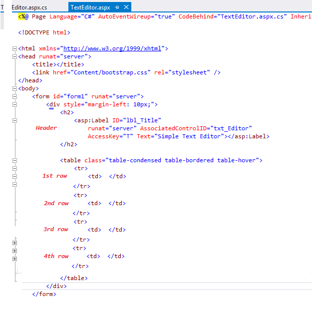
Just above the table we will add a label as the title of the page, and let’s place it inside <h2></h2> tag. To improve the accessibility of the interface, first let’s set AccessKey to “T”, which will allow users to navigate to the textbox with Alt + T combination, second let’s associate the label control with the textbox by setting AssociatedControlID to the id of the textbox, txt_Editor. After these configurations, the user can navigate to the textbox either by Alt + T or clicking on the label.
The first row of the table will include a single control, which is the textbox (ID=txt_Editor). Initially, let’s set it as a multi-line textbox (TextMode=”MultiLine”). Let’s set its width to 50 characteristics (Columns=”50″), and its height to 10 rows (Rows=”10″).
Please check the declaration of the label and textbox controls below:

The second row will include 3 buttons (the first one is to convert the textbox into singleline textmode, the second one is to convert the textbox into multiline textmode, and the third one is to clear the text in the textbox), and 1 checkbox to enable or disable the textbox.

After you move the controls inside the row with the order shown above, please double click each of them separately to create their corresponding event handlers. The html markup should look like similar to this:

2 THINGS to pay attention:
- btn_Clear has JavaScript script in OnClientClick property: OnClientClick=”return confirm(‘Are you sure?’)”
- chk_Enable has its AutoPostBack property set to True, which will make the checkbox behave like button (i.e., when the state of the checkbox change the page will be posted back to the server for processing).
Below is the code that will be executed when btn_Single button is clicked, which will convert the textbox into single-line textmode. The code below first convert the textbox into a single-line textbox that can accept 5-chars input max, then it checks if the length of the user input is more than 5 character-long. If so, it cuts off the text after the 5th character. But, it stores the original text to ViewState with originalText key. Note that you can use ViewState to store additional information by providing a string key value: ViewState[“keyvalue”] = myvalue;
protected void btn_Single_Click(object sender, EventArgs e)
{
    txt_Editor.TextMode = TextBoxMode.SingleLine;
    txt_Editor.MaxLength = 5;//user cannot type more than 5 chars
    //store the user input to a new variable
    string myText = txt_Editor.Text;

    if (myText.Length > 5)//if user input contains more than 5 characters
    {
        //store it to the viewstate
        ViewState["originalText"] = myText;

        //then keep the first 5 characters and cut off the rest
        txt_Editor.Text = myText.Substring(0, 5);
    }
}
Here is the code for btn_Multi, which converts the textbox into a multiline textmode, and retrieve the original text that was cut off when switching back to singleline textmode. When retrieving the previous text, it first checks if ViewState is null or not. If it is not null, this means that some value was stored in it and we can use “originalText” key value to recover it back. If it is null, this means that ViewState does not store a value with “originalText” key.
protected void btn_Multi_Click(object sender, EventArgs e)
{
    txt_Editor.TextMode = TextBoxMode.MultiLine;
    txt_Editor.Columns = 50;//set some initial width -50 chars
    txt_Editor.Rows = 10;//set some initial height- 10 rows
    txt_Editor.Wrap = true;//enable word-wrap

    if (ViewState["originalText"] != null)//if there is such a value in ViewState
    {
       //then restore it back to the textbox
       string originalText = ViewState["originalText"].ToString();
       txt_Editor.Text = originalText;
    }
}
Here is the code for the event handlers of btn_Clear and chk_Enable controls:
protected void btn_Clear_Click(object sender, EventArgs e)
{
      txt_Editor.Text = "";//just make the textbox contain empty string
}

protected void chk_Enable_CheckedChanged(object sender, EventArgs e)
{
      //if checkbox is checked, then the textbox will be enabled.
      txt_Editor.Enabled = chk_Enable.Checked;
}
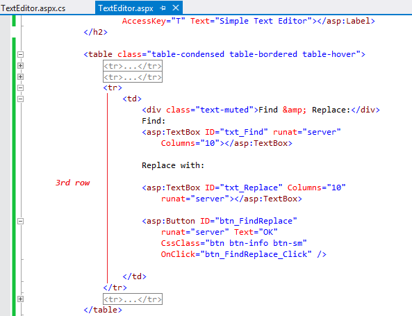
Now, let’s build the Search & Find function. First, add the relevant controls to the third row of the table:

To add the click event handler to the OK button, please double click on it when you are in the design mode.
Here is how your html mark-up should look like:
Here is the code that performs the find&replace (when the btn_Replace is clicked):
protected void btn_FindReplace_Click(object sender, EventArgs e)
{
     string myText = txt_Editor.Text;

     //Replace(oldvalue, newvalue)
     txt_Editor.Text = myText.Replace(txt_Find.Text, txt_Replace.Text);
     //this will search some specific text (entered into txt_Find textbox) within myText variable
     //and will replace them with the text entered into txt_Replace textbox)
}
Let’s build the last part of the application: Changing text-color or background-color of the text editor. For this purpose, please add the following controls to the 4th row of the table (two textboxes with some text around):

The color-boxes you see above are actually textboxes. Asp.Net textboxes function as a color-picker when their TextMode is set to Color. Please see the html markup of textbox declarations.

Please note that AutoPostBack property is set to True for each textbox. That means when the text change in the textboxes, the page will be posted back to the server, in other words, the textboxes will behave like a button. Also not that Text property of the textboxes is set to an initial color by using the hexadecimal color codes.
Please double-click on the textboxes separately, then check the markup again, please see the change below:

As you see new event handlers are added to the declaration of the textboxes: OnTextChanged. This means when we pick a color the OnTextChanged event will be triggered, because changing the color actually means changing the text of the textbox, triggering OnTextChanged event, and causing PostBack event (note that AutoPostBack is set to true for both text boxes).
After you double-clicked on the textboxes, you should have the following event handlers added in the CodeBehind file:
protected void txt_TextColor_TextChanged(object sender, EventArgs e)
{

}

protected void txt_BackColor_TextChanged(object sender, EventArgs e)
{

}
Inside the first event handler, raised by btn_TextColor button, add the code that changes textcolor (ForeColor property); and inside the second event handler add the code that changes backcolor (BackColor property), as seen in the following code:
protected void txt_TextColor_TextChanged(object sender, EventArgs e)
{
    txt_Editor.ForeColor = Color.FromName(txt_TextColor.Text);
}

protected void txt_BackColor_TextChanged(object sender, EventArgs e)
{
    txt_Editor.BackColor = Color.FromName(txt_BackColor.Text);
}
Now, you are ready to test your application!
Please note that the coloring functionality may or may not work differently depending on the browser that you are using to test the application.
 Asp.Net (C#) and Entity Framework Code-First